Gooey is a playful, high-energy brand selling premium Rice Crispy Treats with bold flavors and a fun personality. The goal of this project was to design a visually engaging, conversion-focused website that reflects the brand’s quirky tone while delivering a smooth shopping experience across desktop and mobile.
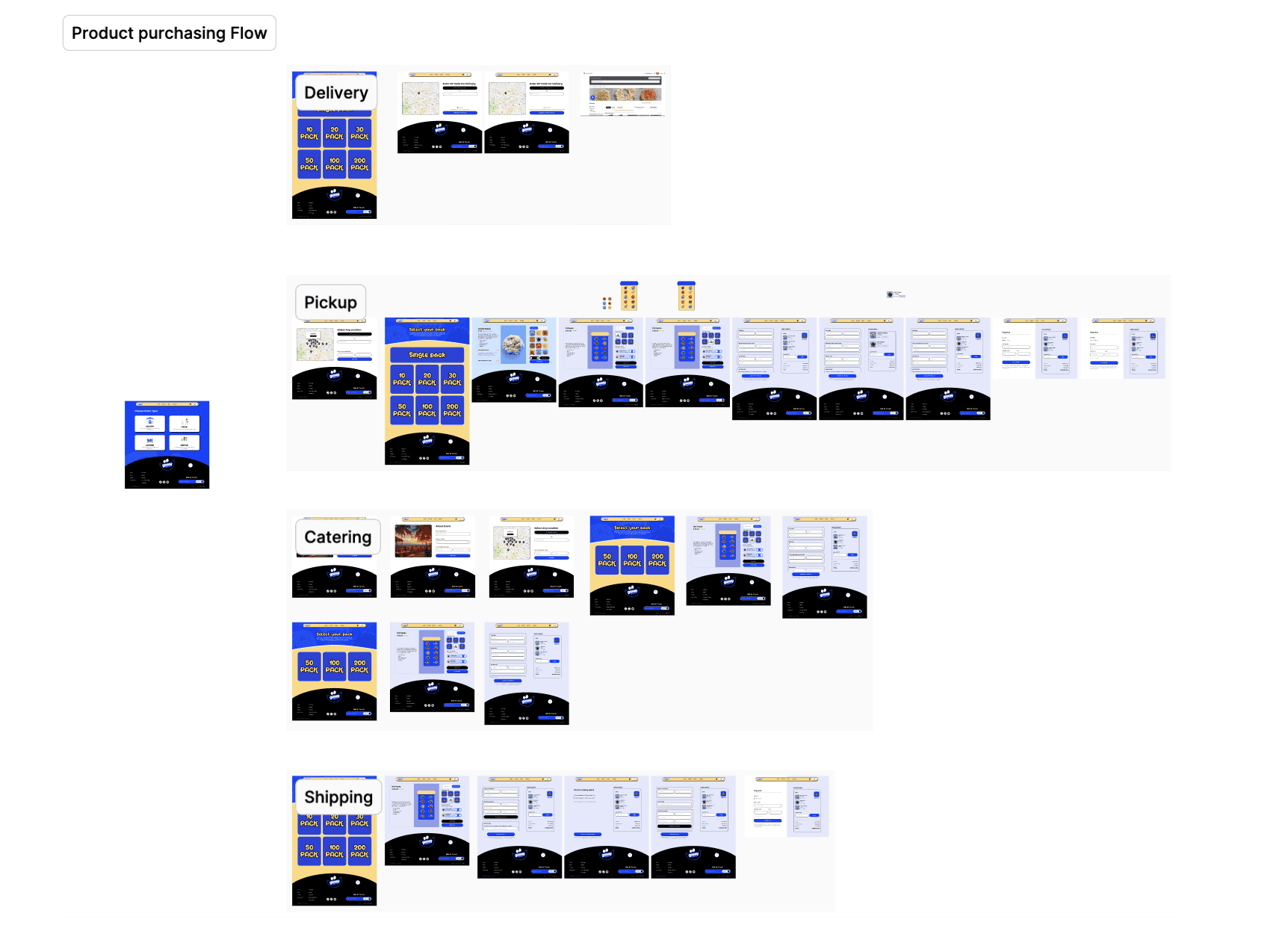
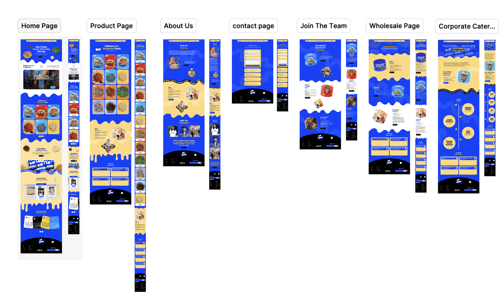
This project includes the Home Page, Product Listing Page, Product Purchase Flow, and Contact Page, all designed with a strong emphasis on usability, storytelling, and delight.

Project Goals
Create a fun, sticky, and memorable brand experience
Design a clear product discovery and purchase flow
Maintain strong visual consistency across desktop & mobile
Balance playful visuals with easy navigation and conversion
Target Audience
Snack lovers & dessert enthusiasts
Younger, Gen‑Z & Millennial audience
Customers looking for unique, gift-worthy treats
Wholesale & bulk buyers
Design Approach
The design approach focused on combining bold colors, rounded shapes, playful illustrations, and expressive typography to match Gooey’s brand voice. The UI intentionally feels fun and energetic while keeping key actions (shop, buy, contact) extremely clear.
The layout uses:
Bright blue & yellow brand colors
Drippy, gooey shapes to reinforce the product identity
Large product visuals to trigger appetite appeal
Clear CTAs to drive action
Challenges & Solutions
Challenge: Maintaining usability with a highly playful design
Solution: Strong layout structure, clear spacing, and consistent components ensured clarity despite bold visuals.
Challenge: Designing a complex purchase flow without overwhelming users
Solution: Breaking the flow into simple steps with visual guidance and clear labels.